
QR menu design guide
QR Code Menu Design Ideas for Restaurants, Cafés, and Bars
Design the tabletop sticker and the menu it opens together. A guest should know what they’re scanning, then recognize your place and find what they want on the phone.
1. Give the restaurant table sticker one job
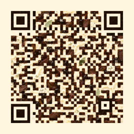
A guest who’s just sat down should be able to tell that the code opens the menu. Put Scan for menu next to the QR code, with the restaurant name smaller. If your table already has a candle, cutlery and a specials card, give the sticker a spot that won’t be covered by a plate.
Use one detail from your existing printed menu, such as its heading type or a warm accent color. Carry that detail onto the phone. A good place for a food photo is next to a signature dish, where the image helps the guest decide what to order.
2. Design a café QR menu for the queue
Put the code where people can scan it while they wait, such as the front of a counter sign facing the line. Use a label that tells them what opens, like Scan for coffee and breakfast. Check it from the spot where the queue normally starts.
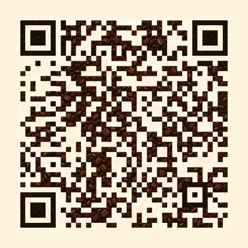
On the phone, put popular drinks and prices near the top. If oat milk, an extra shot or a larger size changes the price, show the extra cost next to the drink. Coffee-inspired artwork can give the sticker character while the menu itself stays simple to browse.
3. Make the bar menu easy to read in low light
A dark drinks menu can suit a cocktail bar. Try warm white text on a deep background, with the price in the same line of sight as the drink name. Give cocktails, beer, wine and alcohol-free options headings people can spot quickly. If your list is short, keep those headings on one page so guests can scroll through it.
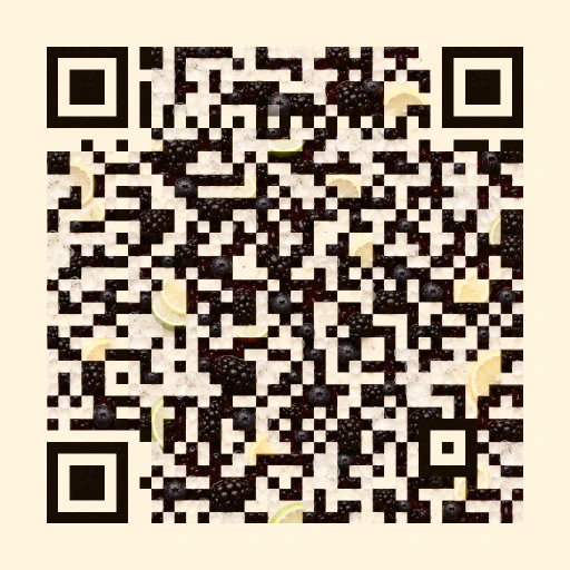
For the printed QR code, start with a light field and a dark pattern. A matte tabletop sticker is worth testing under spotlights and near candles. Scan a proof after the lights have been set for service.
4. Make the first phone screen useful
Open your menu on the smallest phone you have to hand. The venue name and first menu section should appear early, with dishes and prices readable without zooming. Keep the heading style from the sticker, then use a simpler typeface for descriptions and prices.
- Use a single column on narrow screens. Keep names and prices as text so they stay readable when people enlarge the page.
- Show a short set of category links if the menu is long. Give each link a clear label such as Lunch or Cocktails.
- Put photographs alongside the items they show. Use text labels for dietary information so meaning stays clear when color or icons are hard to distinguish.
For normal-size text, aim for at least a 4.5:1 contrast ratio between the text and its background. This applies to the small descriptions and prices guests need to read. W3C guidance on text contrast
5. Test the design before you order stickers
For a standard QR code, keep a clear margin at least four of its small squares wide on every side. Leave that space free of borders, logos and text. If you’re using illustrated QR art, test the exact image you plan to print. Resizing, cropping and printing can change how easily it scans. DENSO WAVE’s QR layout guidance
Print a proof at the final size, put it where the guest will see it, and try it with two different phones in normal service lighting. Check that the right menu opens, then find a dish or drink and its price. If the design is hard to scan, make the code bigger or use a conventional high-contrast code. If you still need to make the code, follow the restaurant menu QR code setup guide.